Greetings, I am new to this forum.. Mac OS 10.13 Finale 25
Is it possible to create a Fermata (Petrucci or other) with a comma instead of a full stop ?
Many thanks.


I suppose you could make a single expression consisting of a comma superimposed on a fermata but I've never seen this notation in any music fonts (like November which has a lot of glyphs) or in printed music, and I wouldn't know what to do with it if I saw it. What are you trying to convey?
Sorry to side-track this post but I see that you're running Finale under 10.13. Since I've refrained from updating my system from 10.12, I'm wondering how you're faring with the combination? Any problems? Also in other applications? Do you experience any 'real' advantages compared to 10.12?
Hello Vaughan, and thank you for this very prompt reply.
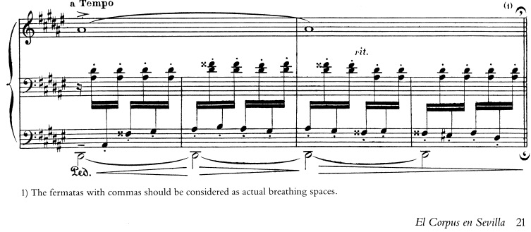
The sign occurs in a piece by Albeniz... Fête Dieu à Seville (Iberia) and it suggests something between a comma and a full fermata (pause).
I have tried superimposing but that is awkward... and there are quite a few examples of this sign in the piece. I well may just use a large comma, if no solution is found.
Ray
10.13 seems to work well with all my apps


>10.13 seems to work well with all my apps<
For me... Upside: Digital Performer is better with yesterday’s update. The tighter integration with iOS is nice. Ability to share my paid iCloud storage with the rest of the family at no additional cost. Photos and videos take up less space. There are other benefits. Safari is improved.
Downside: some minor annoying behavior with Yahoo! Mail. Encore can no longer access certain Apple System fonts — on top of the problems it already had in Sierra (I don’t use it much except to convert old files to Finale). Finale 2011 and Digital Performer 7 do not work anymore but I’ve been using newer erosions for years.
Finale 25 and PrintMusic 2014.5 are unchanged as are most of my Applications. Finale 2014.5 works the same as in Sierra. My understanding is that neither of the 2014.5 products will install properly over High Sierra. Another surprise is that 32Lives still works on plugs that were installed in older OS — this was also announced as a product that would no longer work (as were Office 2008 and 2011 which still do).
The only current 32 bit apps I have are SmartScore X2 and Band-In-A-Box 2017. I hope those companies get off the stick since 32 bit support is supposed to be gone in the next OS. MM went 64 bit last year so there’s hope. Perhaps Microsoft will fix the current version of Office so it works properly — could happen, right?

Gould, Stone, and Read all would indicate that a fermata over a comma is more standard. To indicate a short cessation of the time, a caesura (or caesura with fermata) would make more sense, no matter what Albeniz' publisher did. Either would be easier to design :-)
(Breath marks generally shorten the previous note, they don't really stop time.)
(Breath marks generally shorten the previous note, they don't really stop time.)
Can't agree with that. They often indicate a lift-pause in vocal music or a soloist part—if accompanied by a piacere or else found in a recitative or free cadenza, that's exactly what it means. There is no consistent notation for the lift-pause, however, except to write pause over the apostrophe or make some indication over a caesura.
Anyway, that's how I would interpret the fermata with a comma (for lack of a better term) were I conducting or playing this piece absent any indication to the contrary. And in this case, that is exactly what the Dover indicates. I've no idea if it's in the manuscript.
There probably needs to be a mark that all can agree on for the lift-pause but, till then, we just muddle through.


Hi - read your original post and the replies...
I played around with Fontographer (MAC) and combined a fermata and a breath mark into a single character as you described.
The resulting "font" has one character... the "F" key (shift-f). After installing this font into your computer's OS, it will produce an altered fermata similar to the one in your example above.
Here is a link to the resulting font... it's called "Fermatacomma-Regular.ttf". It will remain in my drop box for a few days. Let me know if you are able to install it and try it out. Should work in both Mac and Windows.
https://www.dropbox.com/s/m5mtuswwgjkp93u/Fermatacomma-Regular.ttf?dl=0
If it works for you and you would like an upside down character also - let me know - would take just a minute to add.
Amazing how this little question has elicited so much interest... I am using an old Salabert edition and thought this special sign quite original, particularly as the typesetting is not of the highest quality. I finally installed the Fermatacomma and size 18 looks fine without really needing the "Spanish" upside down variety underneath.
However, setting a larger font with expression creations is proving a challenge. Should I post this problem elsewhere ?
Please sign in to leave a comment.

13 comments
Date Votes