is it possible in Fin27 to get a metronome mark like the old Petrucci did?


… I was wondering if with the new SMuFl is still possible to get a result like the Petrucci example I showed …
You can still use the Petrucci font.
Also, you can get a similar result using a SMuFL font.
If you use another font than Petrucci (like e. g. one of the new SMuFL fonts), then the characters may not look exactly like the Petrucci characters.
… after a procedure like the one described above …
You can still use the Petrucci font, and the keystrokes still work.
I just tried it, and the keystrokes worked for me.
However, the keystrokes will not work with a SMuFL font, since SMuFL fonts have their characters positioned in other font slots.
Have you tried it yourself?
"However, the keystrokes will not work with a SMuFL font, since SMuFL fonts have their characters positioned in other font slots"...
Exactly what I was looking for...where are the SMuFl "...characters positioned in other font slots", where are the correspondence table between keystroke, character and symbol?
… where are the SMuFl "...characters positioned in other font slots", where are the correspondence table between keystroke, character and symbol? …
I am not sure about the difference between ‘character’ and ‘symbol’ ?
I thought they were the same ???
SMuFL fonts have thousands of characters.
Hence, a complete “correspondence table” would be very big.
Instead, try this:
Text menu > Insert Symbol…
You get to the Symbol Selection where you can browse all the characters, and see their keystrokes.
You could also consider PopChars for both Mac and Windows. Indispensable, IMHO, for browsing and using font characters.
If I misunderstand you, then I apologize.
If you need to see what a specific font character looks like in many different fonts, then the keystroke stays the same in all the fonts.
In all the fonts the same character is located in the same font slot (= has the same keystroke).
To compare what the character looks like in different fonts I would copy/paste the character multiple times, and change the font in each copy.
In that way I can see the different versions simultaneously.
I am not sure I understand, what you mean by your words start every time from "zero".
Please explain.
What are you trying to achieve?
How are you trying to do it?
What happens when you do that?
What doesn't happen that you expect to happen?
I suppose that you, by your words “nowadays Finale fonts” mean the SMuFL fonts that come with Finale - right?
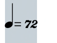
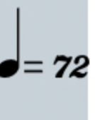
This example was created in Finale, using the Petrucci font:
If you prefer the look of the Petrucci font, then why are you trying to create the very same look with a SMuFL font?
Why do you not use the Petrucci font?
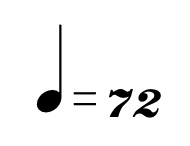
I agree that the number characters in Petrucci are beautiful, and that the number characters in Finale Maestro do not look like the Petrucci number characters.
However, I also disagree with you:
In my opinion the Petrucci note symbol has a too tall stem. I prefer a shorter stem.
And the Petrucci equal sign has too thin lines. I prefer thicker lines.
… which fonts do you use? …
You mean fonts in metronome markings - right?
If the publisher pays me to use a specific font, then I will use that very font.
If I can choose fonts freely:
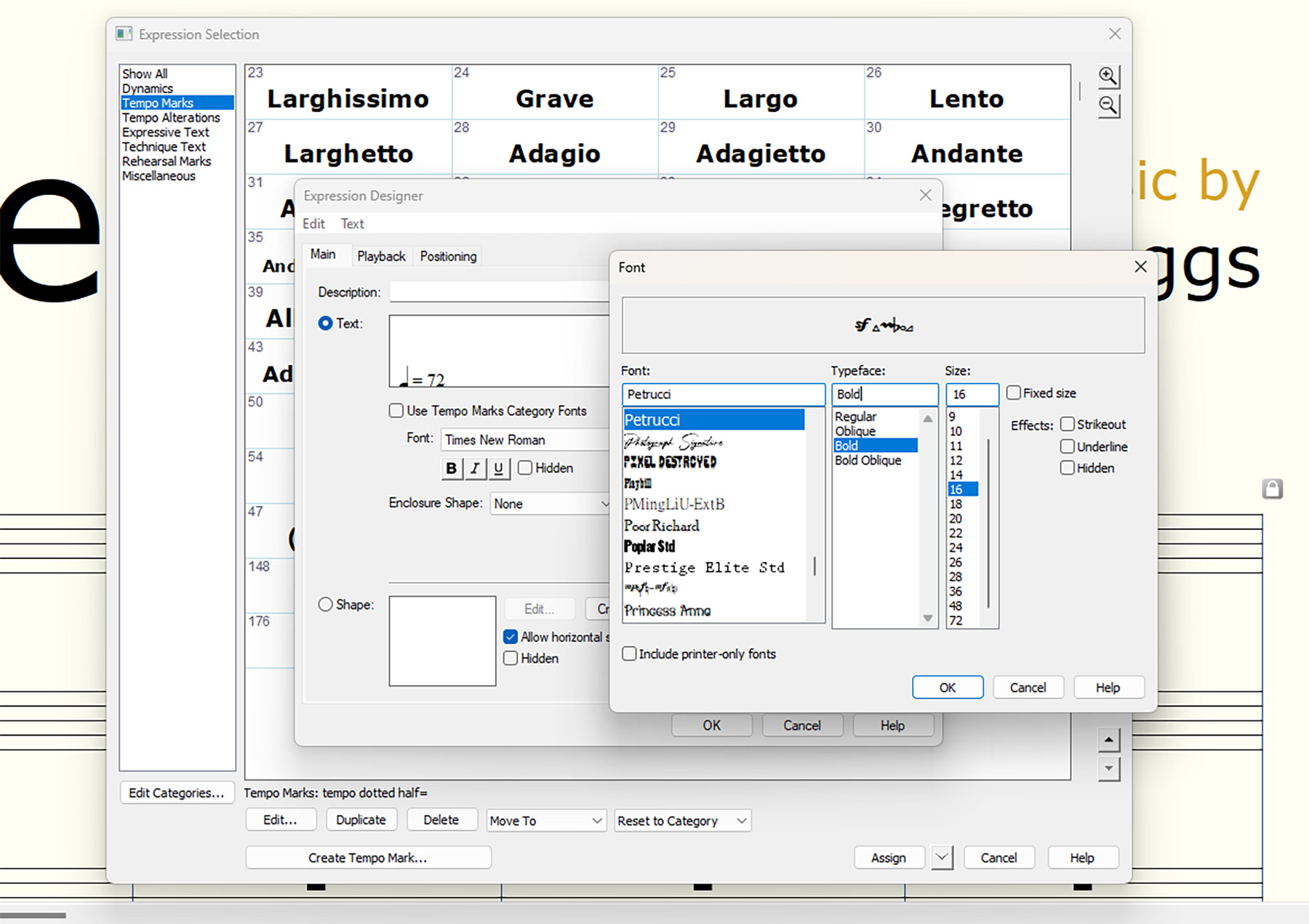
Note symbol: Finale Maestro 21pt
Equal sign: Finale Maestro 18pt
Metronome Number: exactly the font characters you prefer! (Petrucci 24pt)
Please sign in to leave a comment.


17 comments
Date Votes